Mobile Fundraising: Practical Advice

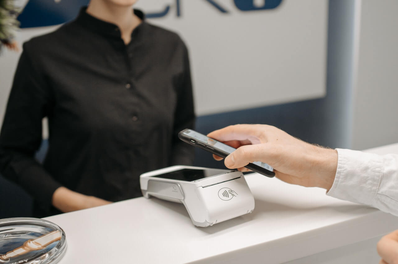
A person raising funds with a smartphone

After some $40 million was raised in $10 gifts through cell phones for the Haiti earthquake response in January, 2010, every nonprofit had dreams of cell phones as mobile donation machines. Even for the Red Cross, those dreams seem to have evaporated.

However, mobile use among Americans has increased dramatically. It’s probably true that among the most passionate, most connected, most generous and successful Americans, smartphone use is even more ubiquitous. What are the implications for nonprofits, most of whom haven’t mastered the internet yet? Here are some thoughts gathered at the Direct Marketing Association’s recent Mobile Marketing Day:

  • Text-to-give is NOT a significant part of fundraising.
  • Most smartphone users view much of their email on their phones, so make sure your email messages will render nicely on Apple and Android devices.
  • Every page on your website should be optimized for mobile browsers; otherwise, if donors click once and get garbage, they’re not likely to click again from their cell phones.
  • Mobile is ideal for getting special event attendees to connect with you in a way that will let you continue the conversation after the event.
  • QR codes let mobile users connect with you after seeing something in print, either at an event, in a publication, or on outdoor or transit media, even your direct mail letter.
  • Ask for mobile numbers (but don’t require it) on your donation form and newsletter signup form. If you can associate numbers with donors, you can track the impact of mobile communications, and you can reach out to donors via phone when their mail and email start bouncing.
  • Mobile users can give via their credit cards on a mobile-optimized donation form. Those gifts tend to be as much as 30% smaller than web page gifts sent from a laptop or desktop computer (but that means they’re 70% larger than the gift you wouldn’t get without such a page)
  • One organization indicated that up to ten percent of cell phone area codes do not match up with the supporter’s zip code, meaning that many people keep their old cell number even when they move.
  • If you believe in the future of mobile communications, get your own short code — the 5-digit numbers to which you can send a text message instead of having to enter a full 10-digit phone number. Don’t settle for a shared short code.
  • Apps are expensive and generally not productive unless you have killer content (think National Geographic).

Since the future of mobile is growing, it pays to recognize its potential for your organization, choose one area where you think mobile can be effective for your organization and get started. Your learning curve can match up with the growth of this channel.

More questions about mobile fundraising? Send me an email!

=-=-=-=-=-=-=-=-=-=-=-=-=-=

Rick Christ has been helping nonprofit organizations use the internet for fundraising, communications and advocacy since 2009, and has been a frequent writer on the subject. He delights in your questions and arguments. Please contact him at: RChrist@Amergent.com or at his LinkedIn Page

=-=-=-=-=-=-=-=-=-=-=-=-=-=

If you would like to comment/expand on the above, or would just like to offer your thoughts on the subject of this posting, we encourage you to “Leave a Reply” at the bottom of this page, click on the feedback link at the top of the page, or send an email to the author of this posting.

Email Quality Matters – and Each Mistake Costs $40 … or more !!

Person writing an email

One of the advantages of online fundraising and marketing is that the data entry is outsourced to the donor. It’s also one of the disadvantages!

When a donor writes a check and mails it to you, you have to pay someone (at your organization, or at a service bureau) to open the envelope, deposit the check, and enter the donor’s name and address into your database. When the donor makes a gift online, they do the work.

Now you might guess that a typical professional data entry person can enter a name and address with higher accuracy than the typical donor would. What you may not realize is that the professional data entry person can enter the donor’s name and address with higher quality than the typical donor can enter their own name and address! Data entry by donors is appalling, and it costs you money.

According to the Direct Marketing Association’s “The Power of Direct Marketing” 2011-2012 edition, email marketing (across all direct marketing segments, not just fundraising) yields a return on investment (ROI) of $40.56 per dollar invested. It would be higher, of course, if more email messages were actually delivered.

You need to have the option on every web page to subscribe to your email newsletter, or take some other action which will have the same result – you get an email address and permission to send further email messages. If that email address isn’t valid, you’ll never reach that potential donor again.

Worse, it will look like your fault (since donors don’t assume they made the mistake). They’ll think you never sent them anything by email. So you should employ some techniques in your form to check and report on mistakes right away, preferably while the donor can still correct them. Some tips include:

• You can add some basic error checking software routines into your
   web page code. Some easy-to-check items include:
     o One and only one @ sign in an email address
     o At least one period after the @ sign
• Print a list of your bounced email addresses regularly. Sort it by
   domain (e.g. aol.com) and scan for obvious errors, like “aol.cmo” or
   “gmial.com”. Correct them or re-enter them correctly into your database.
• Employ more sophisticated instant error checking tools – software linked
   to your website that attempts to validate every email address as it is entered.

Now, you’ll find that your efforts to capture email addresses are yielding even higher returns!

More questions about email fundraising? Send me an email … but type my address carefully ☺

=-=-=-=-=-=-=-=-=-=-=-=-=-=

Rick Christ has been helping nonprofit organizations use the internet for fundraising, communications and advocacy since 2009, and has been a frequent writer on the subject. He delights in your questions and arguments. Please contact him at: RChrist@Amergent.com or at his LinkedIn Page
=-=-=-=-=-=-=-=-=-=-=-=-=-=

If you would like to comment/expand on the above, or would just like to offer your thoughts on the subject of this posting, we encourage you to “Leave a Reply” at the bottom of this page, click on the feedback link at the top of the page, or send an email to the author of this posting.

Saying “Thanks… And…” via Email

Sending emails to donor

If you have a donor’s email address, use it several times without asking for money.

The best way to use a donor’s email address is to thank them for a recent gift, and tell them how their money is being used.

If you have a donor’s email address on file, then send them an email message every time you get a gift via mail or phone. The benefits include:

  • You get to thank them twice: once in the email, and again with the letter they’ll receive in the mail.
  • You can thank them much faster than the standards letter. There’s no reason you can’t hack your system to send an email message of thanks within 24 hours of when their gift is updated to your database. That’s two or more weeks faster than a letter is likely to get to them.
  • They’re more likely to open future email messages from you when they get email messages that are not just appeals.
  • You build the habit of engaging them online.
  • You can invite them do something else online, like become a FaceBook fan, or watch a YouTube video
  • You can show them in sound and motion how their gift is making a difference.
  • Gathering their feedback via a short survey or open-ended question.

To really make the email thank-you message work best, it should be:

  • Personalized: include the gift amount, the project they are helping to support, and the date of their gift.
  • Simple: it doesn’t need fancy graphics, just a logo at the top and a few short paragraphs of copy.
  • Signed by the person who signed the original appeal that triggered the gift.
  • Inviting: give them a few ways to further your mission, via links to FaceBook, YouTube, your website, or a short survey.
  • Far-reaching: If this is a milestone gift (10th, 25th, etc.) or if they’ve given for many years, say so in the email. It will brighten their day to be recognized.

More questions about email fundraising? Send me an email!

=-=-=-=-=-=-=-=-=-=-=-=-=-=

Rick Christ has been helping nonprofit organizations use the internet for fundraising, communications and advocacy since 2009, and has been a frequent writer on the subject. He delights in your questions and arguments. Please contact him at: RChrist@Amergent.com or at his LinkedIn Page

Google Changed the Search Engine Rules

Person using a google search engine

Online fundraising happens

…when people come to your website and make a gift. While you can reach previous donors and prospects with email, the vast majority of online donors are not on your email list – yet.

While you can pay for ads to bring traffic to your website, Google and other search engines will bring the best possible traffic to your site — people who care about your issues.

That’s why up about 50% of new visitors to a non-profit website come via a search engine, and the granddaddy of all search engines is Google … with more than 60% of the traffic.

The best way to draw quality traffic to a web page has always been the “simple” way – have great content. With Google Panda, their new search engine, it’s even more true.

Google used to place more emphasis on links from other sites, especially those that get a lot of traffic. That created the “link swapping” industry, which encouraged links to lots of pages in a reciprocal strategy, designed to create links, even those that didn’t result in clicks.

Google has changed the way it measures “good content,” from one that placed more emphasis on what other sites thought about your page, to one that places more emphasis on what users think about your page.

Google’s new “Panda” search engine places value on what people do at your site, as well as how they get there. It measures:
•  Time on Site: how long visitors spend on pages they get to from Google
•  Bounce Rate: the percentage of users that leave your site without doing anything
•  Page views per visit: How much they poke around your site

It also measures how many times a page is “shared” via FaceBook and other social networks. So make sure that you make it easy for people to share your key pages with tools like “ShareThis” or “AddThis.”

Finally, it also measures what it calls “Branded Search Traffic” – the visits that result when people enter your site name or organization name in Google to get a link to your site. That implies that people are being directed to your site from offline conversations, and come to Google to find your page.

Remember that Google ranks web pages, not web sites. So find the pages that get the most “entry traffic” from search engines and review them using questions found on Google’s own blog: Google’s Guidance On Building High Quality.

What is still important?
•  Original, useful content – tell your organization’s stories
•  A meaningful page title (the headline that shows up in search results)
•  A helpful page description (the first dozen or so words that show up in a Google search)
•  Good calls to action within your popular pages. Getting people to subscribe to your
email list, donate, sign a petition, or share your content on FaceBook all reduce your
“bounce rate” and increase your Panda score. They also produce meaningful results to you.

Do your own mini search optimization audit to see how your audience will or won’t find you in search.
1.  Create a list of keyword phrases that describe your issues, e.g. “hunger Cincinnati”
or “helping left-handed Lithuanians”
2.  Enter them in Google and see where your top page on that issue scores. See who
else is ahead of you and look at their pages to find out why.
3.  Look at your web site traffic reports to see which phrases are bringing people to
your site, and what pages they’re landing on. Those are the best places to start.

More questions about search engine marketing? Send me an email!

=-=-=-=-=-=-=-=-=-=-=-=-=-=

Rick Christ has been helping nonprofit organizations use the internet for fundraising, communications and advocacy since 2009, and has been a frequent writer on the subject. He delights in your questions and arguments. Please contact him at: RChrist@Amergent.com or at his LinkedIn Page

Social Media Enhance Email Success

person-composing-an-email-

Want to increase the impact of your fundraising emails?

Don’t leave online social media out of the picture.

Consider this interesting fact: Americans spend 3 times as much time on social media as they do on email.

Improve your email performance by combining your email messaging with your social media presence. With a modest investment of time and effort, you can adapt your email content to create Facebook posts and Twitter tweets.

Since most email results are captured with a few hours of an email’s launch, it makes sense to put more online effort into those hours by being very present on your social media.

Here are a few quick and easy ways to boost your email fundraising power:

•   Build excitement with posts and tweets a couple of hours before the email release and
    follow with updates a few hours after the launch. Link one of
    your posts or tweets to an online version of your latest email.

•   Provide sample “share” copy with colleagues, volunteers and friends, so they can
    help spread the word via their own social network sites.

•   Use compelling graphics for goal-oriented campaigns such as a thermometer
    on your Facebook page to display the latest results.

•   Include a “last minute reminder” tweet and post for appeals with a deadline.

•   Be active on FaceBook, responding to messages from your fans and mention that
    they should check their email.

Social media expands your reach because it meets your supporters where they “live.” With consistent messaging across channels, it can help increase open rates and boost overall conversion.

Want to know how to earn your donors’ loyalty and keep them engaged all year long through integrated fundraising campaigns? Send me an email!

=-=-=-=-=-=-=-=-=-=-=-=-=-=

Rick Christ has been helping nonprofit organizations use the internet for fundraising, communications and advocacy since 2009, and has been a frequent writer on the subject. He delights in your questions and arguments. Please contact him at: RChrist@Amergent.com or at his LinkedIn Page

QR Codes and When Not to Use Them

person using QR code for payment

“Cool” isn’t a fundraising strategy

A client asked me last week if their organization should start putting QR codes on their direct mail envelopes.

“Yes,” I answered, “…when you’re ready for that.”

For the vast majority of nonprofits dabbling in online fundraising, there are at least ten other things you should be working on ahead of QR codes. This article will just let you be more conversant on them, and help you deter the efforts of people who think that employing the latest cool piece of technology IS a strategy.

What’s a QR code?

It’s an ink-blot that serves as a hot-link to a web page from the offline world. Smart-phone apps use the phone’s camera to scan the code, which contains a link to a web page. “QR” stands for “Quick Response.” You can get a QR code for any web page. Here’s one:

What does it take to make it work?
1. An audience that appreciates them: Smart phone sales have recently exceed sales of all previous types of sales, but clearly not everyone has them, or knows how to use them. If your audience is tech-savvy, you can explore this further. Note: “tech-savvy” does NOT mean the same thing as “young.” What percentage of your web audience now accesses your site via mobile devices?

2. Mobile-optimized web pages: People are going to scan QR codes from the cell phones, and that will bring them to a page on your site. If that page doesn’t render well in the Android and iPhone operating systems, you’ll just frustrate those most tech-savvy donors.

3. A great conversion strategy: A QR code only brings you a tech-savvy web visitor. How are you going to get them to give you a mobile #, email address, or donation?

4. Somewhere to put them: Three ideas come to mind.
a. On the outer envelope and letter sent to prospects. NonProfit Times research shows that almost half of prospects check out a new nonprofit before they decide to give, and the greatest number of them go to the nonprofit’s website. Make it easy for the prospect and you’ll get more of them to donate.
b. A high-tech scavenger hunt. If you have a museum or other physical location (or multiple locations around a city where you have a strong presence) then a QR code at each site can link to a ‘more info’ page about that site, or a trivia question that furthers your mission. This is great for a conference exhibit hall too.
c. Print or outdoor ads and brochures. Nonprofits are sometimes gifted with print or subway ads. There are few ways to measure the impact of those ads, or to generate additional action from them. This is one way.

Now you know enough to be dangerous. For most of you, go back to making your email messages work better. For the more daring, who meet the criteria above, have some fun!

For more information, scan the QR code above to download a recent whitepaper on mobile technology for nonprofits.

Can’t figure out the QR code? No Smart Phone? Ask Me the old fashioned way – email.

=-=-=-=-=-=-=-=-=-=-=-=-=-=

Rick Christ has been helping nonprofit organizations use the internet for fundraising, communications and advocacy since 2009, and has been a frequent writer on the subject. He delights in your questions and arguments. Please contact him at: RChrist@Amergent.com or at his LinkedIn Page

FaceBooking Your Organization

FaceBooking Your Organization

The Usability of FaceBook

“My organization’s website is static and boring, frankly. Our FaceBook page is updated all the time and very popular.” The Executive Director of a local nonprofit told me that.

This local humane society has 1,214 friends on FaceBook. That’s 3.3% of the rural population of the county it serves! That’s equivalent to a national organization having just over ten million FaceBook friends!

When I pressed her for details, the following additional contrasts arose:

 • One reason our FaceBook is updated more often than our website
   is that it’s easier to update FaceBook.
 • There are many more people, even our own supporters, on
   FaceBook at any one time than there are on our website. Of course
   there are more potential supporters on FaceBook!
 • It’s easier for supporters to share thoughts with us on FaceBook
   because of the ease of leaving comments and tagging us in photos.
   (FaceBook users are already “trained” in using your FaceBook page;
   they may have trouble navigating your web site.)

Taking these observations to actionable recommendations, it makes sense to put some serious effort into “FaceBooking” your nonprofit:

 • Build and maintain your organization’s FaceBook page. Add photos,
   use the FaceBook involvement widgets like surveys, and
   encourage friends to tag you in their posts (friends bring friends).
 • Consider FaceBook ads, which let you target to a great degree and which
   only cost money when people click on them (and come to your
   FaceBook page).
 • Create a “welcome” tab for your FaceBook page that new visitors come
   to first. It can entice them to “friend” your page and encourage
   their involvement.
 • Add FaceBook’s widgets to your website, which will update with your
   FaceBook activity and encourage web visitors to join your FaceBook crowd.
 • Consider adding donation tools to your FaceBook page.
   PayPal has some tools, and third-party widgets like Razoo and FundRazr
   allow you to use the PayPal interface to set up fundraising pages that your
   FaceBookfans can promote on their walls!

The humane society takes a photo of every family as they leave with the animal they’ve adopted, and posts it to FaceBook immediately. Can you think of similar ways to use FaceBook to demonstrate the effectiveness of your organization?

Questions about online social networking? Or, how to improve your results?
Ask Me.

=-=-=-=-=-=-=-=-=-=-=-=-=-=
Rick Christ has been helping nonprofit organizations use the internet for fundraising, communications and advocacy since 2009, and has been a frequent writer on the subject. He delights in your questions and arguments. Please contact him at: RChrist@Amergent.com or at his LinkedIn Page

Thanking Your Online Donors

A thank you card for donor

When I was young, there was a rule about thank-you notes. If I got $5 from a distant aunt, I wasn’t allowed to spend it until after I had written and mailed her a thank you note. When you were young, you probably had a rule at your house that was similar.

It’s a great rule for fundraising professionals too, yet we often do a lousy job of it online.

After you’ve struggled to improve your online donation process [See: Audit Your Own Website (Part 1) & Audit Your Own Website (Part 2)] you need to appreciate that a first-time online donor is on a trial relationship with you. The way you communicate with that donor sets the stage for whether you will broaden and deepen that relationship, or whether it will be a “drive-by” donation.

Thank-you Page: Immediately after the gift is processed, the donor should see a page that promptly proclaims “Thank you for your gift!” If you are able to access the information on the gift when you display this page, thank them by name, e.g. “Hank Lewis, Thank you for your gift!”

Then, immediately, invite them to take more action.
• Invite them to watch a video on your website showing how their gift is being put to good use.
• Give them a button they can click to proclaim to their FaceBook friends that “I support [Your Organization here].”
• Invite them to complete a short survey, so they can express their interest in your mutual cause (open-ended survey questions are great because you can learn more about the vocabulary that the donor uses – this is great for follow-up appeal copywriting)

Thank-you Email: Most donation processing systems send an email immediately after the gift is completed (though one out of six organizations to whom we gave recently sent us nothing). Make sure this is a welcoming email. As my colleague, Heather Fignar, puts it: “This should not be a receipt, but a receptionist.” She means that the email should be welcoming and gracious, not merely a recitation of the details of the gift. Again, offer them options for learning more about your organization and proclaiming their shared passion for your cause.

If your donation process merely spits out a receipt, and you can’t change it, then you need to regularly import your new donors into your email system and send them the email message you want to send them. Two email messages are better than one.

Thank-you Letter: It is common, but not required, to send online donors a printed thank-you letter in the mail. This is a great way to introduce them to the direct mail appeal cycle. Here are some important things to consider:
• This does not replace the need for an immediate online thank-you page and email.
• Get them into your direct mail system quickly – within four weeks – or you will lose the connection you established with the gift
• Some people will not want a mail relationship with you. Honor that. Make it easy for them to opt out. It will not only save you money on wasted mail costs, but it might help maintain the relationship with the new donor.

Questions about the online giving thank-you process? Or about how to improve your results? Ask Me.

=-=-=-=-=-=-=-=-=-=-=-=-=-=
Rick Christ has been helping nonprofit organizations use the internet for fundraising, communications and advocacy since 2009, and has been a frequent writer on the subject. He delights in your questions and arguments. Please contact him at: RChrist@Amergent.com or at his LinkedIn Page

Online Giving: Audit Your Own Website (Part 2)

Using your website for online giving

Hints On How To Make Giving To You A Lot Easier

a: Always have a prominent “Where the need is greatest” choice – many people will trust you to allocate their gift as you need to, and unrestricted gifts are the primary goal of every client we’ve ever had.

b: Give people the chance to give a gift to two or more funds at the same time. It’s surprising how many people will give to multiple funds online; these donors tend to be better repeat giving prospects

c: Offer the option to make this a recurring gift. Some nonprofits generate a surprising number of new monthly donors from their website each month.

d: The way you arrange the gift options on your page matters. Test a horizontal gift array ($25, $50, $100, or “other”) against a vertical array. Test an ascending array against a declining array. Test different amounts in the array. Each test will yield a different rate of completed donation forms and average gift amounts.

e: Online gifts by credit card are NOT the only way people like to give online. Give them choices including PayPal, a printable form, and e-check.
[See: “Getting The Whole Pie”]

f: After you’ve gotten their gift amount and attribution, then ask if it’s an honor or memorial gift, and if so, collect that information. Then get their name and address, and finally, ask for their method of payment. This way, if they have to go hunt for their credit card, they’ve invested enough time already that they’re likely to get up off their chair and find it.

g: Don’t ask questions that are not necessary for completing the gift. Phone numbers, “how did you hear about us” and other pieces of useful information tend to get in the way of people completing a gift

h: The donation form is no place for links to other pages on your site with more information. You don’t want to give them chances to leave the donation page except by clicking the “submit” button at the bottom of the page.

i: There will always be errors made by donors in the donation process. They’ll enter their credit card number incorrectly, for example. Make sure that your error messages are clear and forgiving. Here’s a good example of a bad example:

j: Measure the success rate of your donation page:

Look at your web site analytics reports (Google Analytics, Webtrends, etc.) and look at the total “page views” of your donation form each month.

Divide the number of online donations (of all types – PayPal, printed forms, phone, e-check) into the number of page views. That’s the completion rate of your form.

Then divide the total dollar amount of online gifts by the number of gifts to yield an average gift amount. Keep testing different arrangements of your form until you have maximized those two ratios.

Keep reviewing your own site — make it easier to find, easier to get to your donation page, and easier to complete the gift — until you start to see real increases in your online donation results. Do this internal work before you invest a dime in drawing more traffic to your website.

Questions about the online giving process? Or, how to improve your results? Ask Me.
=-=-=-=-=-=-=-=-=-=-=-=-=-=
Rick Christ has been helping nonprofit organizations use the internet for fundraising, communications and advocacy since 2009, and has been a frequent writer on the subject. He delights in your questions and arguments. Please contact him at: RChrist@Amergent.com or at his LinkedIn Page

Online Giving: Audit Your Own Website (Part 1)

A-business-auditor-reviewing-their-online-donation-process

While billions of dollars are donated online annually, your nonprofit is probably not getting its fair share. And that’s probably because your own website is getting in the way.

We have recently made online gifts “secretly” to over 80 nonprofit organizations with some surprising results, which we’ll be talking about in this and future issues.

Reviewing your online donation process is the first step in improving your results.

1. Can web visitors find the donation page?
You need an obvious, easy-to-find link on every page. “Obvious” means it has to be where people look when they scan a web page: across the top navigation or down the left hand side. Anywhere else on the page is not as good.

“Easy to find” means it stands out from all of the other navigation links. If you only have five navigation choices on your menu, then people can find it just by scanning. If you have more than five, make the “donate now” link stand out in a different color or size.

The link should say “Donate Now,” not something vague like “ways to help” or “support us.” Having a text link in the top navigation, and a bold graphic button elsewhere on the page, is even better. Less than 25% of the websites we studied had an obvious and easy to find link to the donation form even on their home page.

2. Once they find the link, do they go straight to the donation page?
Far too many organizations take someone who’s ready to give on a detour, displaying page after page of opportunities to give appreciated assets, to make planned gifts, etc.

Finding the “donate online” link on these pages often isn’t easy. The ideal “donate now” link on the home page takes a potential donor directly to the donation form. Yet less than one-third of all sites we studied brought us directly to a donation form. The rest had an intermediate page; some had two or even three intermediate pages!

3. How complicated is your form to complete?
Once people get to your form, it should be straightforward and easy to fill out. The best format, according to testing we’ve done, is to first invite the donor to specify a gift amount, and if you have options for different funds, determine how the gift is to be applied right away.

=-=-=-=-=-=-=-=-=-=-=-=-=-=
Watch for Part 2: ” Hints on How to Make Giving To You A Lot Easier”
=-=-=-=-=-=-=-=-=-=-=-=-=-=
Questions about the online giving process? Or, how to improve your results? Ask Me.
=-=-=-=-=-=-=-=-=-=-=-=-=-=

Rick Christ has been helping nonprofit organizations use the internet for fundraising, communications and advocacy since 2009, and has been a frequent writer on the subject. He delights in your questions and arguments. Please contact him at: RChrist@Amergent.com or at his LinkedIn Page